I was responsible for designing a product module where our customers could generate reports to access their historical telematics data.
The ability to generate and schedule detailed reports and (in addition to exporting them) having a variety of options to work with data in the browser itself became something that set us apart from our competitors.
noise_control_off
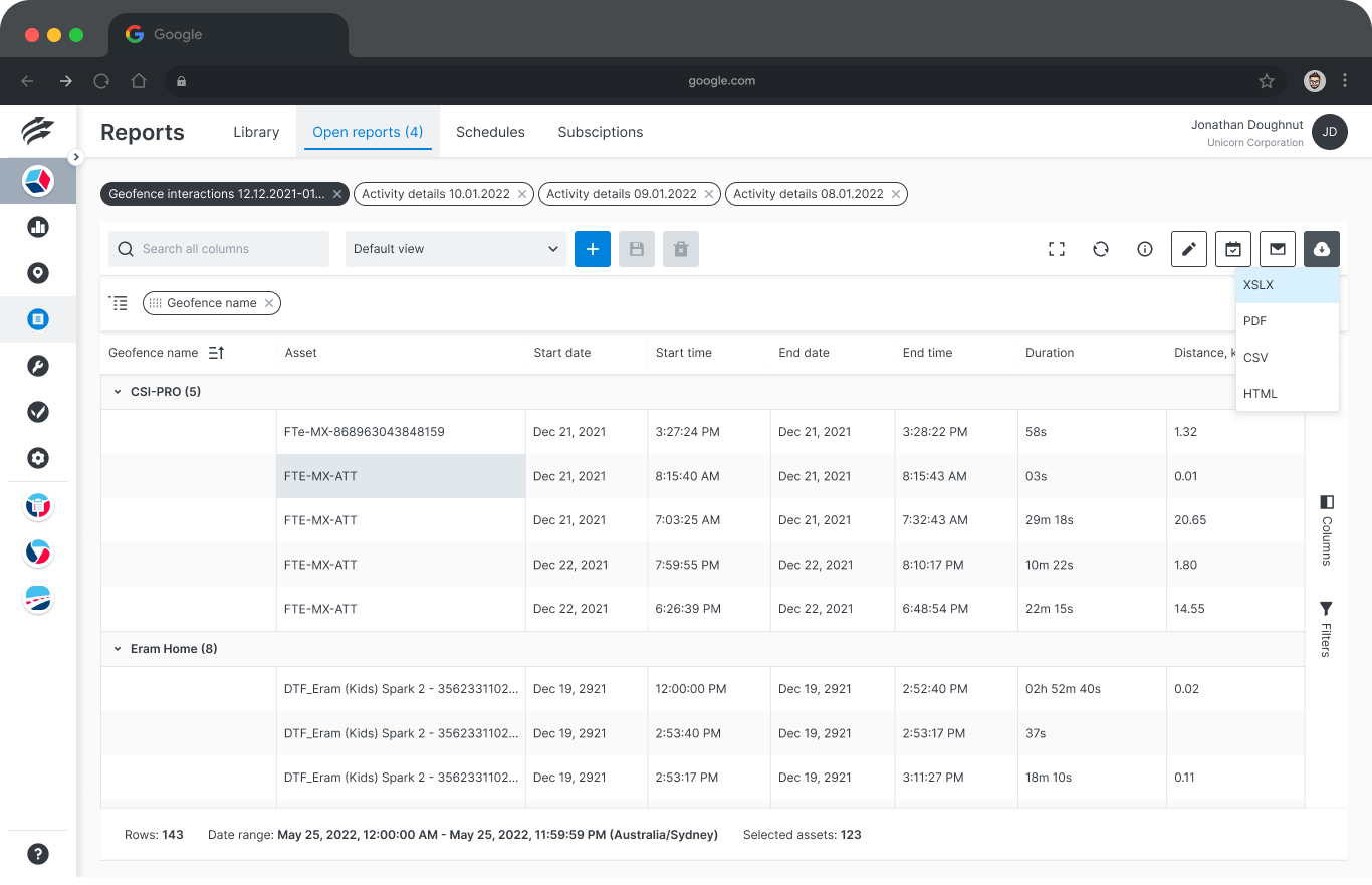
Displaying large amounts of data in an easily workable format.
noise_control_off
Creating a workflow that has less intrusion from modals.
noise_control_off
Visually integrating third party data management software.
Positive user feedback proved that I had succeeded in creating an intuitive, easy to use experience despite information density.
You will find detailed information about the different sections below.
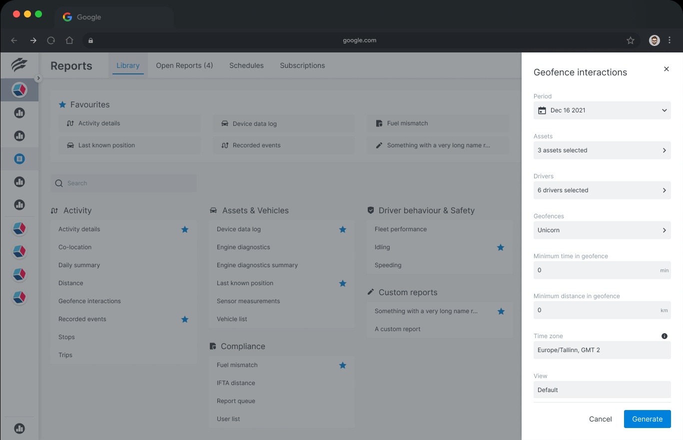
Before starting I checked how our competitors handled user access to historical data. Most only allowed data export, some had rudimentary options to view data from just one sensor. A lack of similar solutions in the industry was an interesting opportunity to experiment and explore.
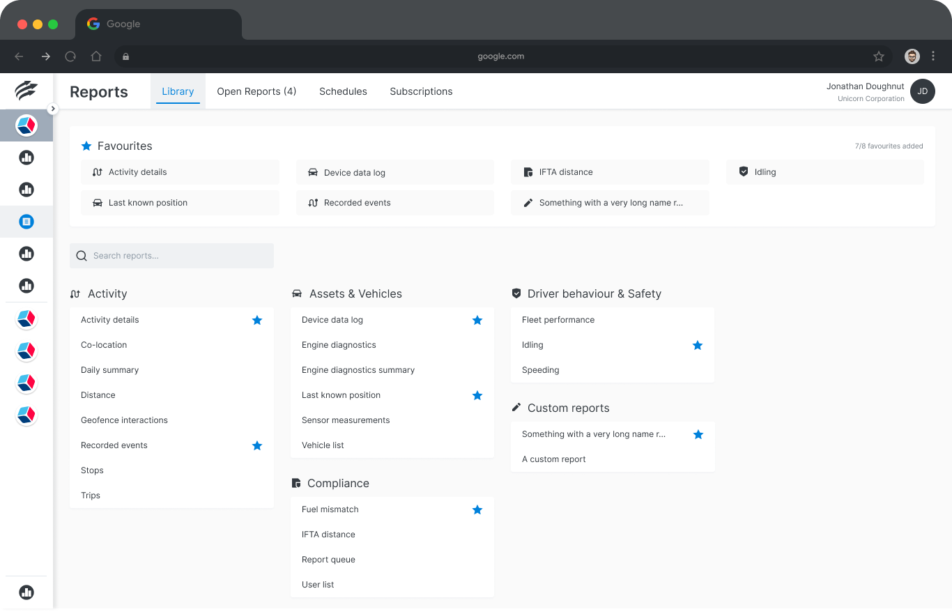
There were some requirements I had to keep in mind: the ability to add favourite reports and all reports in the library being visible at once, with extra space for potential future additions. This pushes the content heavily towards long lists of text. Icons as category markers for favourites may not seem as intuitive as using category names, but it provides a needed visual break and reduces visual clutter from competing texts.
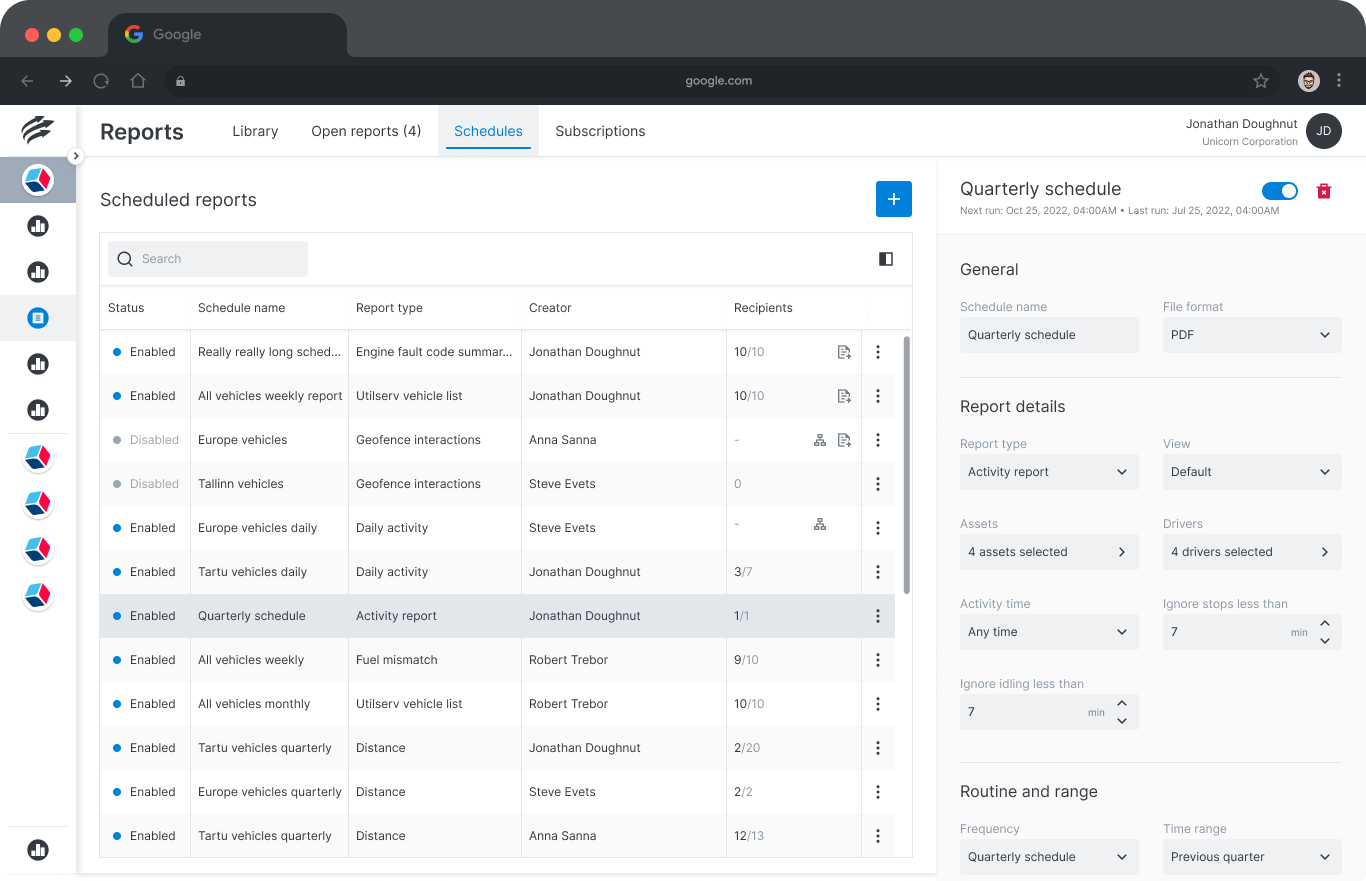
The design is based on other materials in the design library but all elements (save for the search bar) are newly designed. Among other things I created a side sheet component to avoid the rather inelegant situation of a modal opening atop another modal.
This
Figma file has detailed designs as well as documentation for developers.
When you are viewing Figma files please click the Expand UI button in top left to see all the pages in
the file.
I worked with these requirements:
noise_control_off
Multiple generated reports being available at once..
noise_control_off
Current report can be saved as a scheduled report.
noise_control_off
Current column and filter setup can be saved and shared within the organization.
noise_control_off
Description of all the table grid column options.
My aim was to maximize space available for the data itself since most of our customers were mainly laptop users. Product management originally wanted to have some features constantly visible but after seeing the design options they came around to my view.
The most challenging part of the design here was visually integrating third party data management software. I had to track down CSS classes down to minute details and write CSS code for each of them myself.
Design in Figma.This page had complexity added several times after the design was originally completed. This kind of feature creep is not uncommon but adding new layers of content can easily start to corrupt design logic, as evidenced in design files below.
I originally created this layout proportion for a different project and it took some convincing to get the design team on board, half-half style layout had been the standard since the start. You can see in the design files how difficult it is to display more than a minimal amount of information on the more data heavy side using half-half layout, and I used that to push for change.
This layout got implemented only after I had left the company, and this example image is the only part of this design I had a chance to update.
It is a solid UX win in my book, though, as it is now their standard in similar contexts.
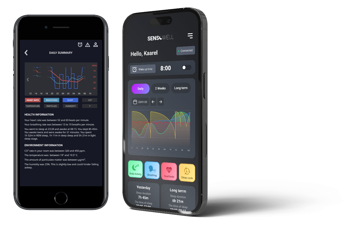
Design in Figma, new layout example is at the bottom of specifications and documentation page.I joined the team in a very early stage. The product itself is a high tech mattress or mattress topper embedded with sensitive sensors gathering a variety of data from the environment: your breathing, heart rate, duration, phases and quality of your sleep, CO2, particulate matter and humidity levels in the air as well as ambient temperature.
Ultimately the project was paused as there were competing ideas about the direction the app should take, considering the possibilities it was not very surprising. Unfortunately I was already engaged in another project when development started up again, but the final, polished version uses mostly UX I created as well as some of my functionality suggestions.
Updating and maintaining a design library is something many designers consider relatively thankless and uncreative work. Still, well constructed, researched and documented components are vital for effective and consistent design work, and something I value a lot.
Here are some examples of how I have approached design library maintentance.